Elevating the My Sky App and reduce Churn rates through Native Motion & Micro-interactions.
- Role: Mobile App Product Design.
- Tools: Figma, Userzoom, and Protopie.
- Focus: Customer Service, Experience Design, Motion Interaction, Native iOS/Android Features.
The Challenge
The My Sky App serves as the primary customer service touchpoint for millions of customers. While functional, the experience was a number of slow loading web views with only the entry screens being native. The goal was to identify opportunities where native animations and transitions could move beyond “delight” to actually solve usability problems and reduce cognitive load in order to drive key business metrics.
Design Process
- The Approach: Discovery & Strategy I spearheaded a discovery phase involving deep-dive workshops with both internal stakeholders and customers. The objective was to map customer decision-making processes regarding Sky TV and Mobile products.
- Facilitation: Led knowledge-sharing sessions to gather business requirements and align them with user needs.
- Competitor Analysis and identification of key customer journeys, end to end.
- Mapping journeys in line with “Sky UI” the my Sky Site and App Design System and evolve it where necessary.
- Design ideation to Figma and user journeys and prototypes.
- Prototyping & Validation: We moved quickly into rapid prototyping using Figma and Protopie.
- Testing: Concepts were tested via remote unmoderated sessions (Userzoom) and face-to-face labs to validate that the motion design reduced cognitive load rather than adding distraction.
- Seamless handoff and collaboration with engineering teams.
The outcome was that three main areas were prioritised for animation and transitions:
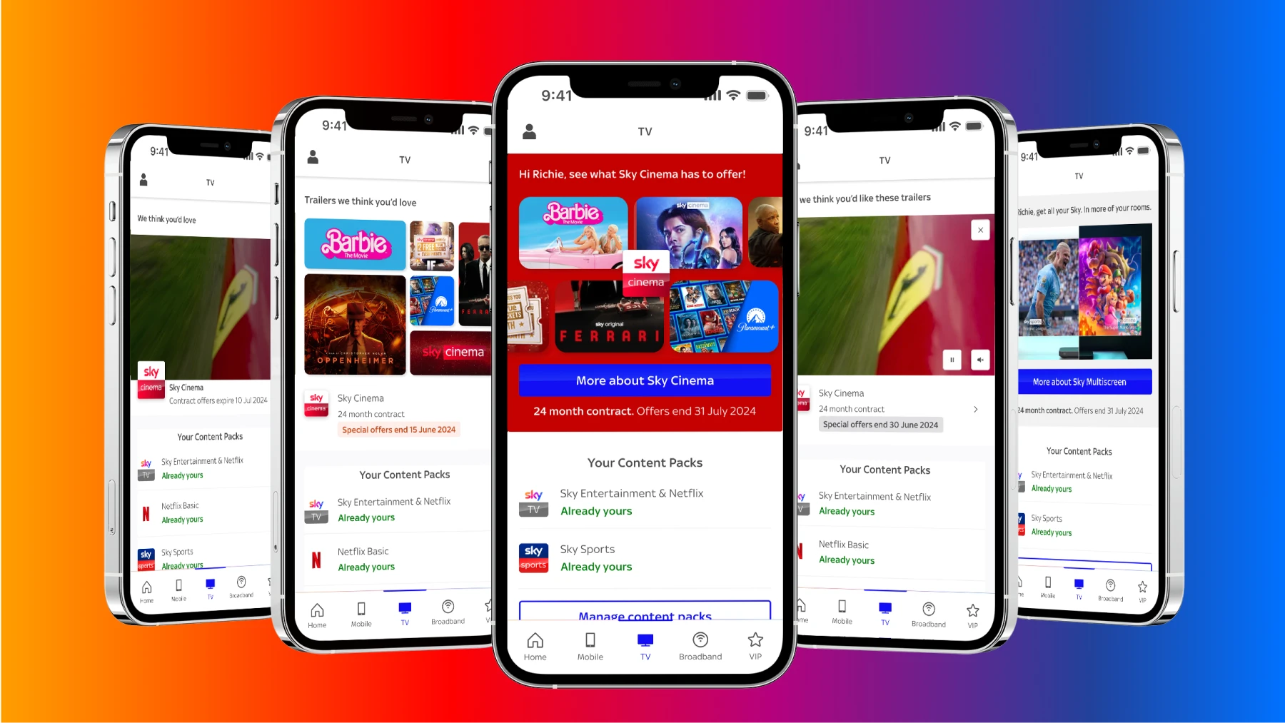
- Elevating Premium Content: We redesigned the transitions between high-level Hub pages and deeper content screens. By using shared element transitions, we maintained visual continuity, helping users understand where they were in the app hierarchy.
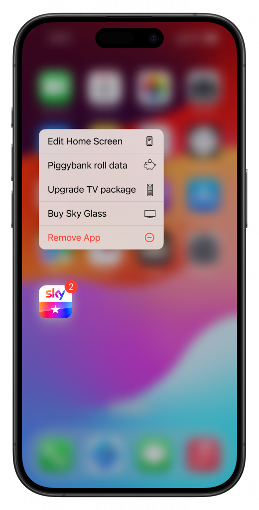
2. Visualising Data Transfer: iOS and Android TV advertised ‘Piggybank’ animation for Sky Mobile Phone contracts. This was to promote the feature which allows customers to roll data from ‘Piggybank’ of unused data to any SIM on your account (average customer has multiple family members SIM cards on the same Sky contract). The animation wasn’t just visual flair; it provided immediate feedback on the transfer action and increased the usability and saw a huge uptick in key metrics as well as featuring in Sky’s TV and web advertising campaigns.Elevating Premium Content: We redesigned the transitions between high-level Hub pages and deeper content screens. By using shared element transitions, we maintained visual continuity, helping users understand where they were in the app hierarchy.
Outcome:
Focused user attention on relevant content areas and improved engagement metrics for TV contract upgrades.

I also brought some Native iOS and Android features to the app such as iOS Widgets and Shortcuts: